After reading What is a PLP, many of you asked if sites can have more than one PLP. The short answer is YES, but there are very specific reasons a site (or ecommerce app) might want to do this.
If you didn’t read What is a PLP, the TL;DR is: it’s a listing page of ALL products (well, most of the time), generally accompanied by toggleable filters. Its purpose is to help visitors discover or browse products to find what they want.
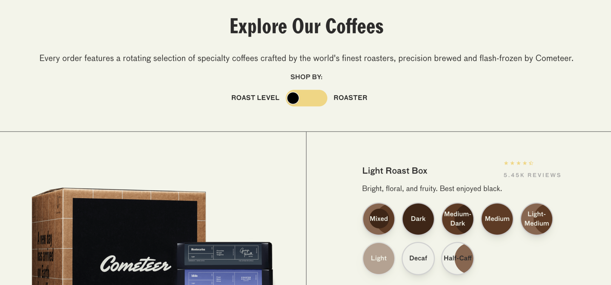
Our friends over at Cometeer have a great example of a PLP. Their page allows customers to view all coffee varieties and then filter by roast (dark, medium, light).

Why have more than one PLP?
If you walked into a physical store like Target, you’d expect things to be organized by department. If you wanted a cold medicine, you’d go directly into the Pharmacy & Wellness area and look for the Cough & Cold aisle. While Target offers a wide range of categories of products, if you’re just looking for cold medicine, none of the other categories actually matter – you just want to find one or two options of cold medicines and buy them.
If your site’s visitors are often only looking for one particular category of product exclusively, creating more than one PLP can help them find what they’re looking for faster. It can also help create more tailored experiences, which creates a deeper connection with visitors.
But isn’t sorting enough?
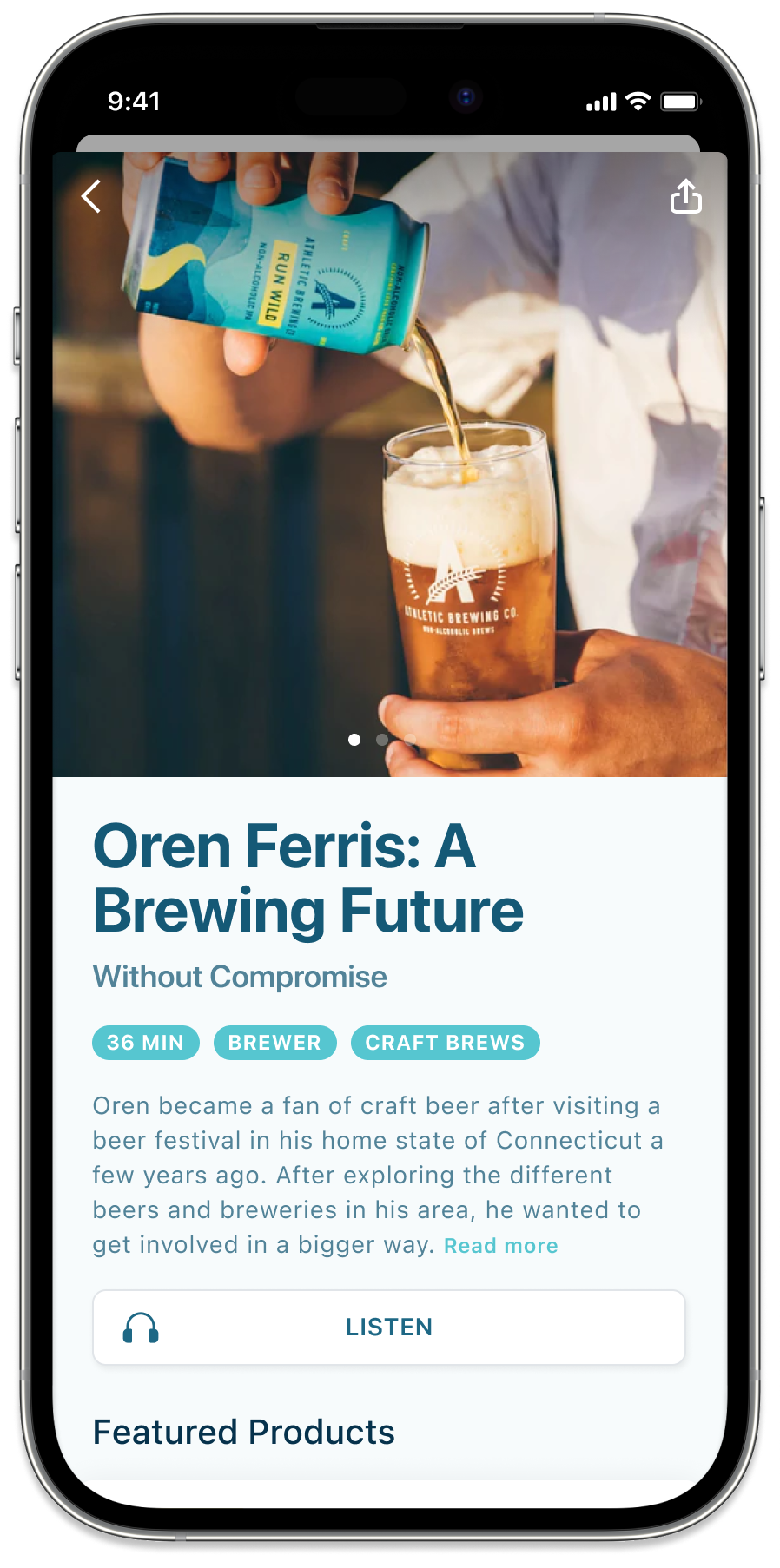
While standard sorting and filtering might be enough for some sites, it’s less than ideal for others. One of our clients, Athletic Brewing Co., is a very experiential brand, and their customers are extremely passionate about very different things. While some people are very passionate about Ironman and triathlons, others are passionate about microbreweries and experimental brews.
A PLP that’s designed for Ironman athletes might include a brand ambassador’s podcast or blog about taking training to the next level, accompanied by the lowest carb-count brews, while a different PLP that’s designed for brew aficionados might contain a list of the most experimental brews paired with a video from the brewmaster about brewing technique that uses only the freshest ingredients.

Clearly, clearer.
You see – sometimes, offering common sorting tools can be a huge miss if audiences differ significantly. Creating a place that feels-like-home for each audience segment can be a great way for brands to build deep, lasting connections with audiences.
And isn’t that the holy grail of marketing communications anyway?


