We feel you.
We’ve always felt you, of course. You being our clients. We’ve always felt the privilege (and responsibility) of developing digital products for you that engage, inform, connect — and convert that experience into sales.
But at Wonderful, we feel you even more now. That’s because we’ve become our own client. We recently launched Wonderful brand coffee aged in whiskey barrels. Our journey ranged from learning about roasting to fashioning a brand image to designing the packaging, website and app.
Going into the coffee business has given Wonderful a better understanding of client goals and challenges, a better understanding of how to create products that exceed those goals and challenges — no matter the industry.
Cool beans, right?
Party time! Excellent!
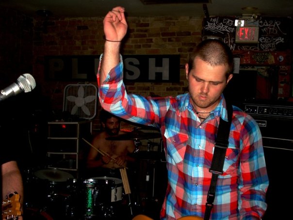
Johnnie Munger, Wonderful’s CTO, once whipped his head in a metal band with Dana Fehr, founder-owner of Decibel Coffee Works of Tucson, Ariz. The friends wanted to collaborate on a project that tapped into their love of metal and good coffee, and into Johnnie’s tech chops and Dana’s java cred.
The answer was right in front of them, rich and dark and steaming: We’ll create a signature line of coffee and let Wonderful bring the brand to life.
Within and beyond
The coffee needed a brand name that jibed with Wonderful’s identity: offbeat, cheeky, quirky, sometimes edgy, with imagination mixed in. The team brainstormed at length, finally deciding to call the coffee Second Sight.
The name embodies the power of piercing vision, the ability to look beyond the obvious, beyond conventional wisdom, to see potential and possibilities and truth. The name felt mystical, exciting, and distinct from the twee-reclaimed wood-faux authenticity of so much coffee branding.
We’re off to see the wizard…
Questions immediately emerged to guide next steps. How would the look of the brand match the spirit of its name (and its partial origins in metal mania)? What would those visual elements be? What would inspire them?
Johnnie dug through classic 1970s rock posters that embraced the far-out, the psychedelic, and a hint of darkness (in keeping with the edgy side of the Wonderful identity). Blacklight posters, with their inky backgrounds supporting vibrant colors and forms — and their hindsight cheesiness, in keeping with the lighter side of the Wonderful DNA — struck Johnnie as the right foundation for the look of Second Sight.
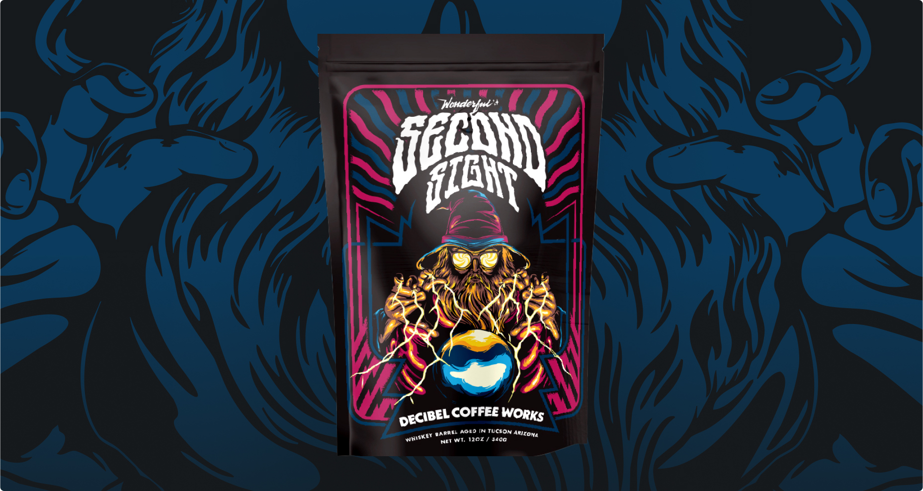
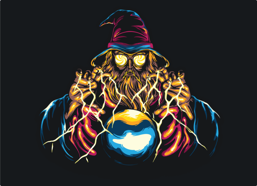
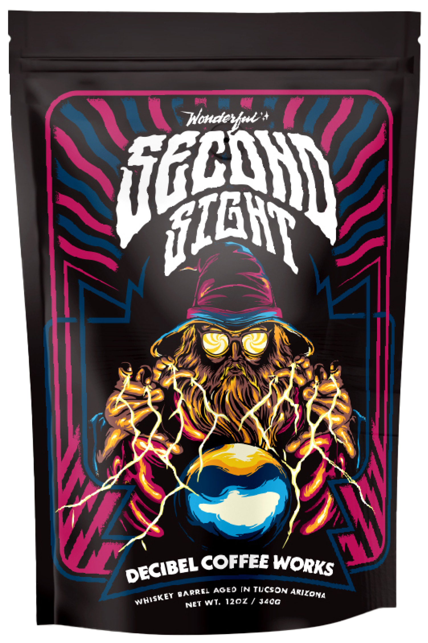
Josh Benedikt, lead visual designer at Wonderful, decided a wizard would embody the mystical magical qualities of clairvoyance, or second sight. After several versions, he created a hand-drawn wizard in a storybook hat, bolts of lightning surging from his fingers to grasp a crystal ball, swirling sunglasses shielding his eyes (because the future of the coffee is bright).
The wizard (deliberately a bit humorous) is set against a black light background punctuated by groovy wavy colored lines of force and prescience.
Packaging the magic
With the Second Sight wizard, as with every commercial image, form had to serve function, which Josh kept top of mind when he began designing the packaging. His key considerations included:
- Visually aligning the Second Sight and Decibel Coffee Works brands because the products would share displays and digital storefronts. The solution: The lines behind the wizard and the package text recall similar elements on the Decibel Coffee Works bags, tying the brands together.
- Finding the right balance of colors, and gloss to matte, to deliver the blacklight effect in two very different environments: product packages and digital screens.
- Ensuring the legibility of graphic and text elements, particularly on the limited packaging space, without sacrificing aesthetics. Every word needs to be both eye-catching and legible, and the use of icons and additional art can’t risk making the end product feel overcrowded.
The screen test
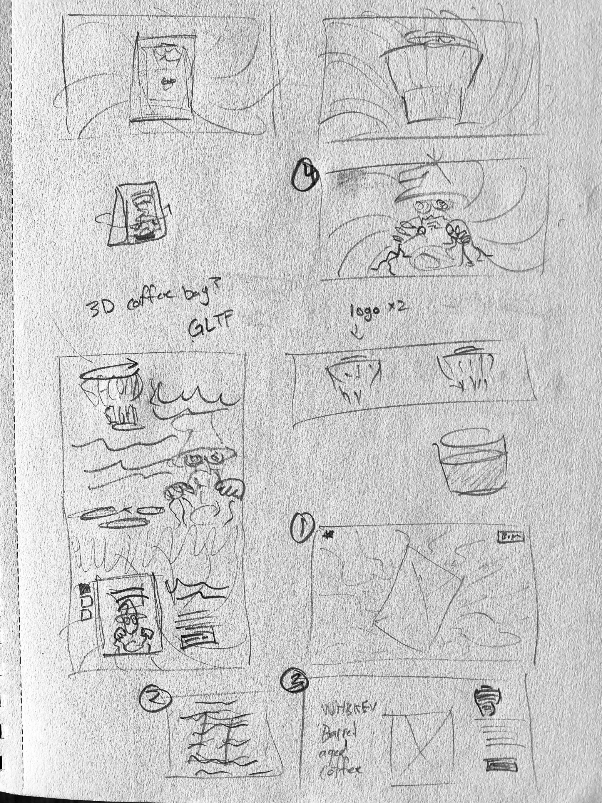
Because Second Sight packaging was so visually arresting, the Wonderful team created a digital experience that did justice to this dynamism. Josh partnered with fellow Wonderful team member, developer Arjun Kakkar, to design and code an experience that would make the content jump off the screen.
Exploring the core website elements
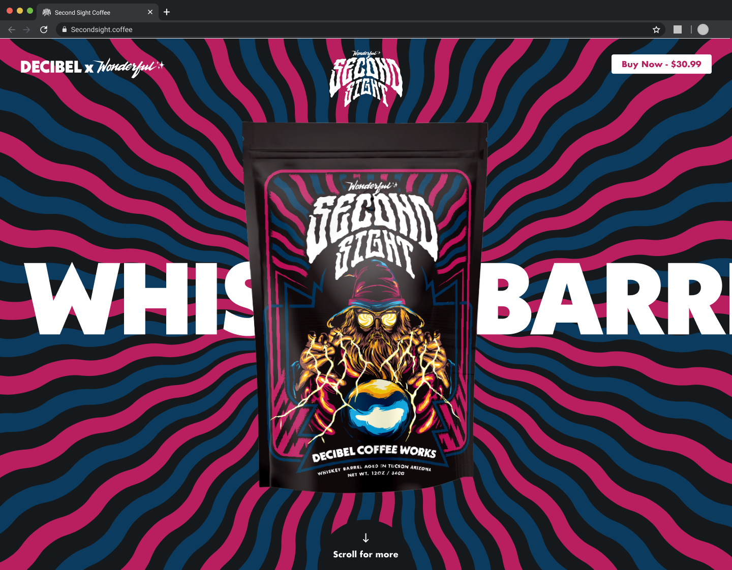
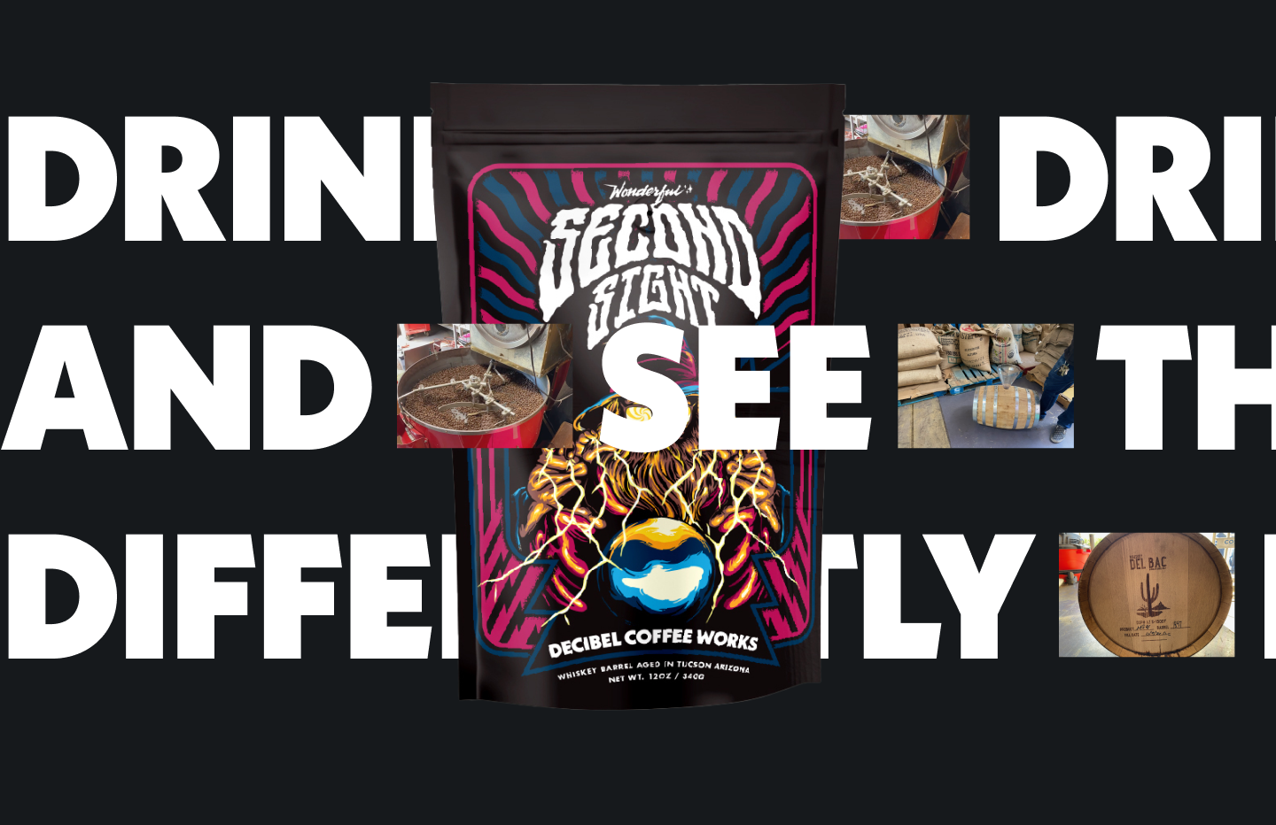
Upon landing on the website, visitors are greeted with a somewhat vague loading screen, intentionally designed to entice immediate action. The use of coffee-related copy was paired with a clear “play” button to beckon you inside the digital experience. The coffee bag spins into view, then holds. But not really. Swipe or move the cursor to give the bag the spins. Brand keywords slide across the screen behind the bag. Undulating bands of color, also behind the bag, flow toward the vanishing point of the image. Skilled coding made possible this movement and the sensation of recession in depth. Arjun enabled physically realistic light rendering so it looked, to quote him, “wayyyyy better.”
As always, the brand leads the experience. That’s literally true with Second Sight. As you journey, physically and experientially, through the content, that content responds to your touch. The content takes you on a digital journey inside of the packaging and product, bringing to life an experience that would match the power of actually consuming the coffee. We intentionally led you on a journey that would mirror the feeling of actually consuming the product.
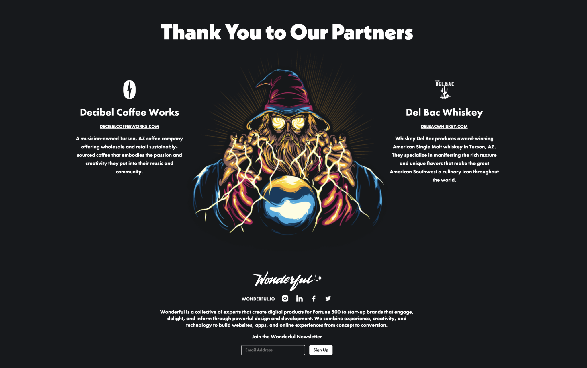
The page concludes with a message of gratitude and connection to our collaborators, including Tucson-based Whiskey Del Bac, the providers of the “cowboy coffee” bourbon kick that rounds out the unique flavor profile of Second Sight. We included a newsletter sign-up call-to-action which funneled interested customers directly into the Wonderful marketing funnel and links to our social media channels.
The buying power
No brand idea, image, packaging or digital experience —no matter how cool — mean anything unless they help move product. In this case, bags of Second Sight coffee.
To that e-commerce end, the add-to-cart button is always present on the website. A click leads directly to the Decibel Coffee Works cart, reaffirming the brand partnership and saving Wonderful time and money on developing or integrating the purchase process. This also allowed fulfillment and shipping to run smoothly, as Decibel has a distribution process in place, and the product could ship directly from their warehouse within 24-48 hours. The website was also extensively tested to ensure its dynamic elements and purchasing worked well on mobile.
At Wonderful, working with Decibel Coffee Works to create Second Sight coffee has brought us new appreciation for (and insight into) how inspiration, branding, image, packaging and technology must mingle seamlessly when you’re bringing a product to market.
Like we said, we feel you.
Feel the powers of Second Sight daily by purchasing a bag of your own. We’ll see you in the next dimension.
